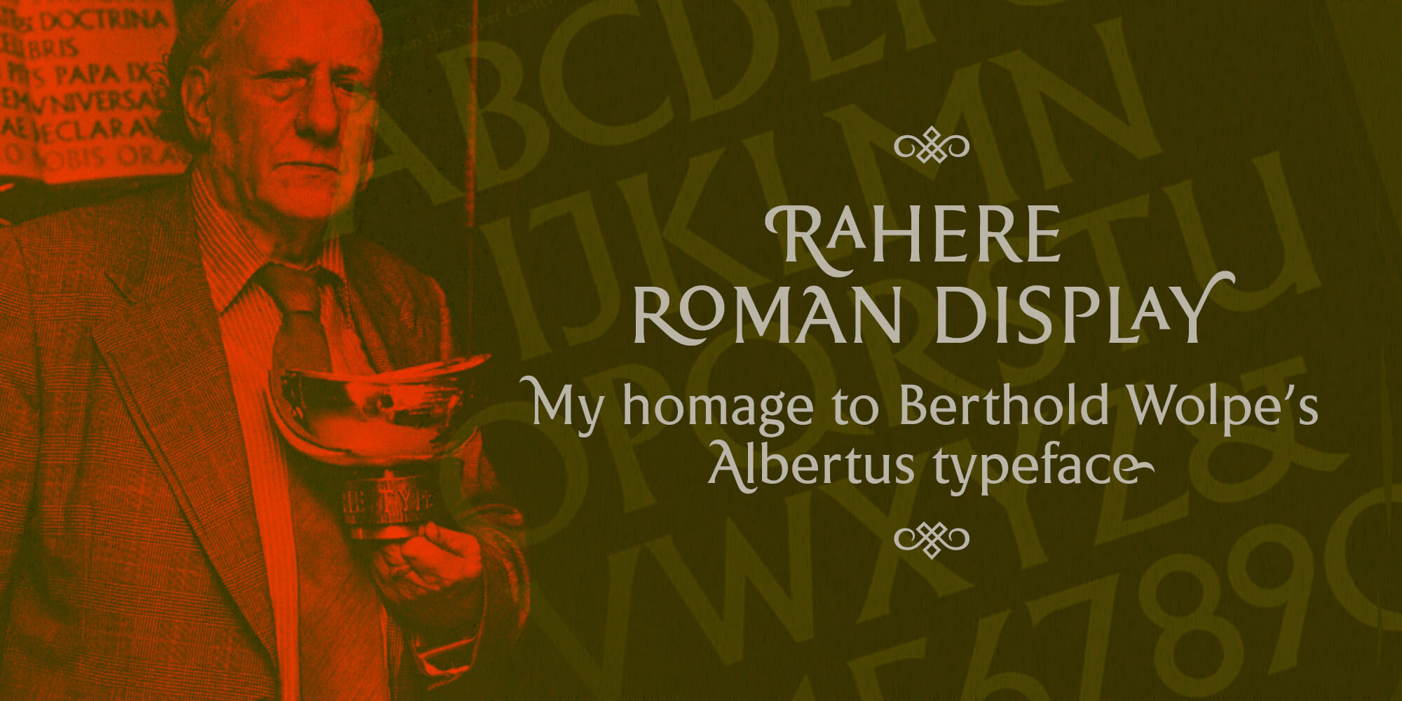
The story behind Rahere Roman Display font and the considerations when creating a new design that an existing typeface has influenced.
After releasing Rahere Sans, my initial plan was to design a condensed variant*. However, on a whim, I changed course. Instead, I designed some display fonts to complement Rahere Sans and put the condensed sketches on the back burner. Rahere Roman Display was the first display font in the family (and probably my favourite so far).
Although I designed Rahere Roman Display to work as a display font alongside Rahere Sans, it owes much of its existence to Berthold Wolpe's lovely typeface, Albertus.
Since my days as a student – over 30 years ago – I've been a fan of Wolpe's work, especially his lettering and font designs and, in particular, Albertus. It's always been one of my favourite typefaces. Designed between 1932–40, it's also an enduring design, still as fresh looking now as it was over 80 years ago.
My previous career had been in engineering, so the sharply cut serifs fascinated me, as though Wolpe had cut the letters by hand from sheet metal using a pair of snips (he may well have done as I believe he cut the original letters for some bronze inscriptions).
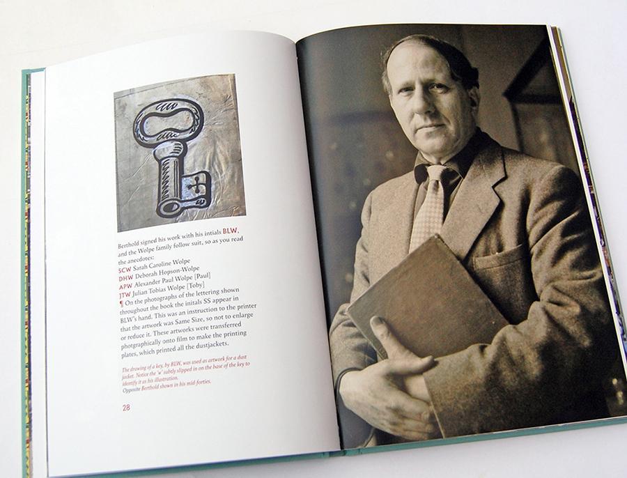
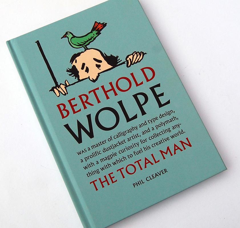
Wolpe was definitely a one-off. His work bristled with confidence and vigour – a spontaneous, bold and playful style – underpinned by the skill of a great artisan. Professor Phil Cleaver has put together a delightful book, Berthold Wolpe – The Total Man, available from The Lettering Arts Trust bookshop, which is crammed with anecdotes and insights into his life. As well as examples of finished work, there's a host of images showing pasted-up artwork, dotted with blocks of white correction paint and instructions to the printer, a fascinating glimpse back at how artwork used to be done before computers (and a splash of nostalgia for those of us old enough to remember getting stuck into paste up with a T-square, Spray Mount and a scalpel).
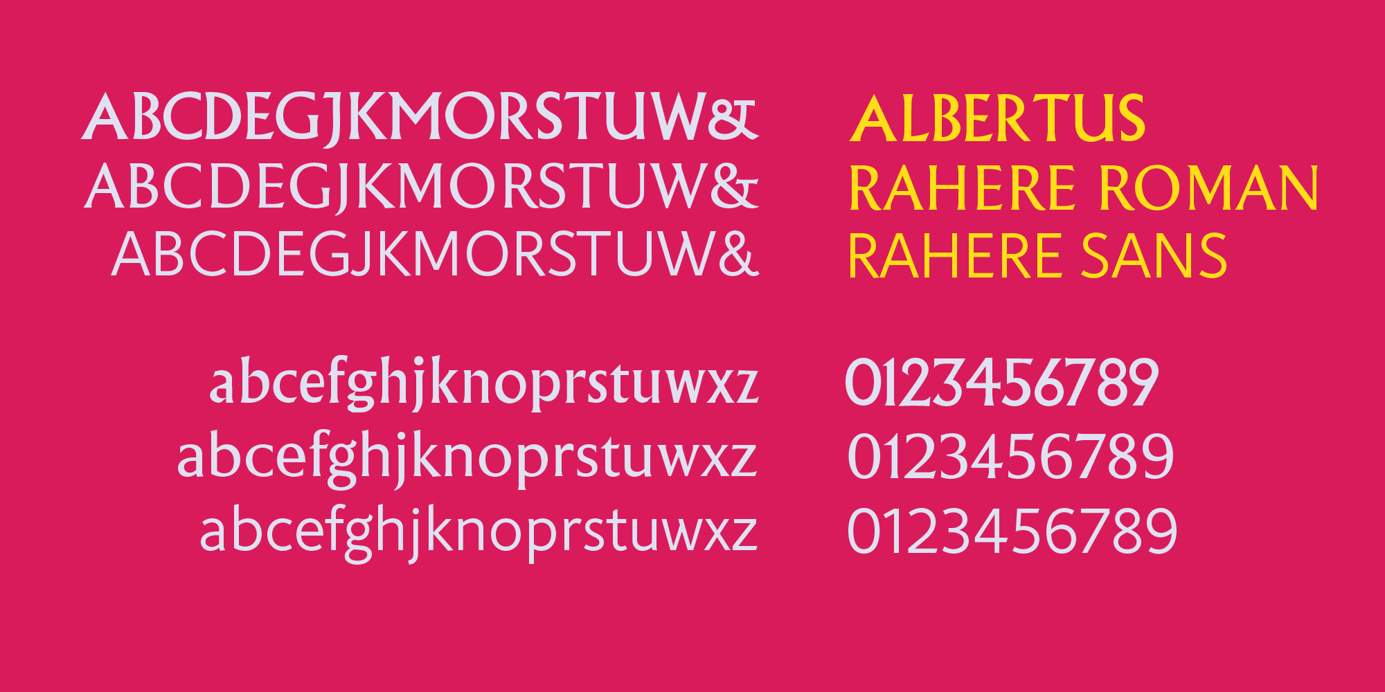
So when I began designing Rahere Roman Display, my aim was to incorporate the sharp, metal-cut qualities of Albertus while keeping the proportions and shapes of Rahere Sans. I hoped to create a versatile display font useful for a wide range of applications and, like Albertus, a classic font that could weather the storms of fashion (I'm still waiting for flared jeans to make a comeback). I also wanted to take advantage of the OpenType features and incorporate swash characters, ligatures, alternatives and ornaments.
I feel the finished typeface is a pretty decent effort. The design strikes a nice balance between expressing its own identity and a respectful nod to Albertus. At display sizes, it stands proud and robust, yet elegant at the same time; at smaller sizes, the lowercase works well for longer pieces of text.
Once it had gone live on MyFonts, invariably, I spotted a few niggling oversights (slight weight issues, the odd bump, that sort of thing), but, hey ho, I imagine most type designers experience the same irritation.
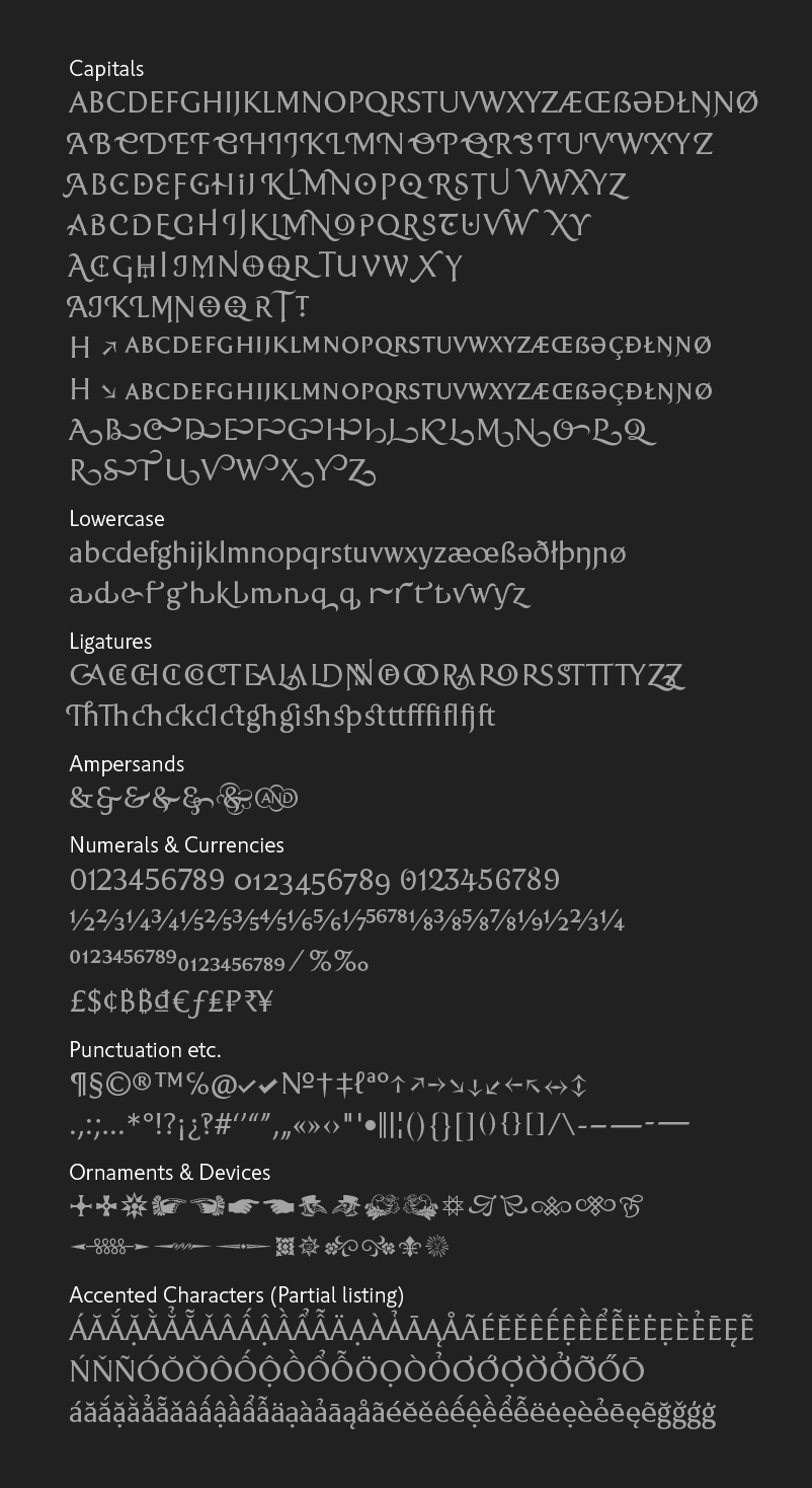
Weighing in at over 2,000 characters (including six ampersands, two sets of small capitals – inferior & superior – and 26 ornaments), I may have gotten a bit carried away with overfeeding the Glyphs palette. That's the joy of designing a new typeface though – you never know where it will take you.
Rahere Roman Display is a classic display font with lapidary overtones and all-round charisma that will appeal to serious typographers, graphic designers and anyone looking for a beautiful, multipurpose font.
Read more about Rahere Roman Display
*I'm still working on the condensed version of Rahere Sans and there's an outside chance I'll finish it by the end of 2023.