In this article, I explain how going through cancer helped revive my love for type design and defined the naming of my extended typeface family, Rahere.
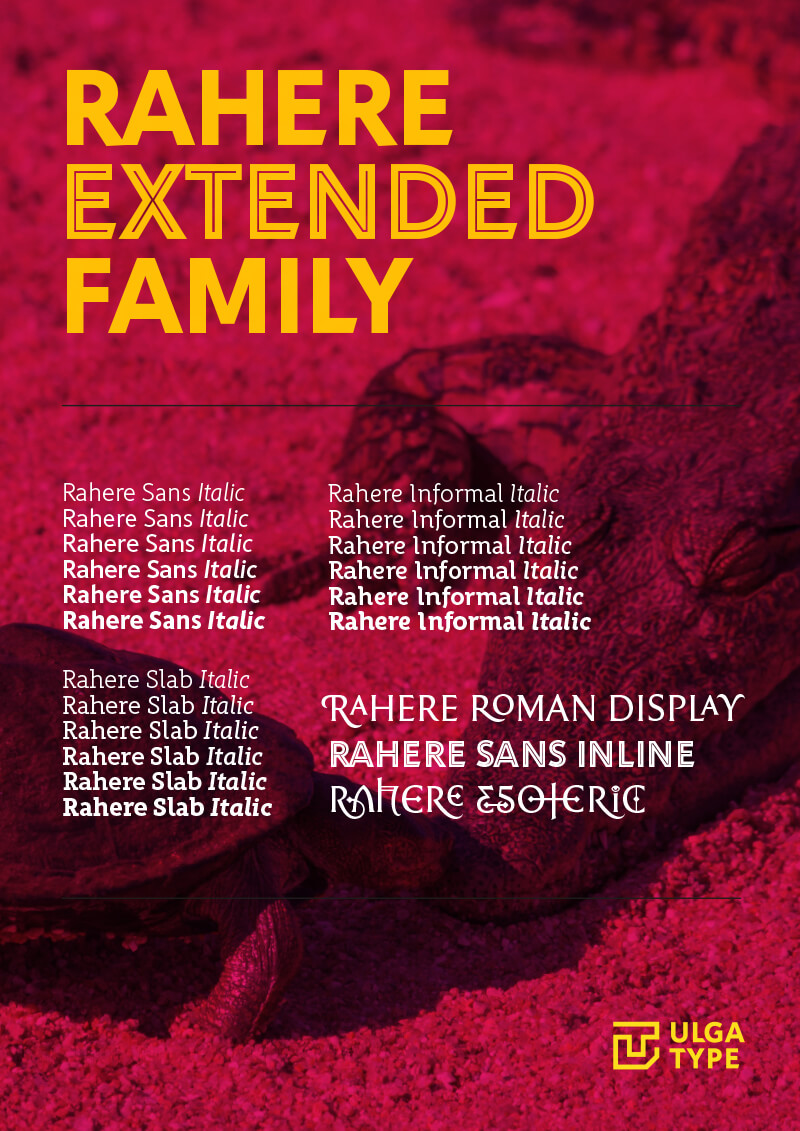
After a fifteen-year hiatus from designing typefaces, I released Rahere Sans in 2019 as a family in six weights with corresponding italics. Since then I have expanded the family and to date (May 2023) there are two more multi-weight typefaces: Rahere Slab and Rahere Informal typefaces and three display fonts: Rahere Inline, Rahere Esoteric and my favourite, Rahere Roman Display.
What triggered my return to type design and subsequently choose the name Rahere Sans?
Rewind to June 2007. I was in remission from testicular cancer (that had spread to the lungs) after surgery and four rounds of chemotherapy, but less than three months later, a blood test showed that the cancer had already returned. Within two days, I was called into St Bartholomew's Hospital (commonly known as Barts) in London, where they specialise in treating relapsed testicular cancer. I endured another four gruelling months of aggressive, high-dose chemotherapy before going into remission again, and – fingers crossed – I've been cancer-free to this day.
Going through any life-threatening illness inevitably forces you to reevaluate your life and things that really matter to you are squeezed into focus. One of the positives to come out of the cancer experience was it made me realise how much I missed designing typefaces (why I gave up is another story).
So, around 2010, I started sketching out a clutch of typeface ideas in Adobe Illustrator, including a humanist sans-serif design which showed enough promise to develop it further. The next step involved researching and relearning how to use a type design programme. Following a period of trial and error, I settled on Glyphs App and imported the characters to begin the lengthy process of refining, spacing & kerning, adding weights and designing the italics.
It was also time to think about a name for the typeface.
When choosing a name for a new typeface, I use several routes to find the right one. Sometimes it's the design itself, a place, or a person, but on this occasion, as this was my first design since remission, I wanted a name that would somehow bind the typeface to my cancer experience. Having read a lot of cancer-related material, a name was already swimming around my mind.
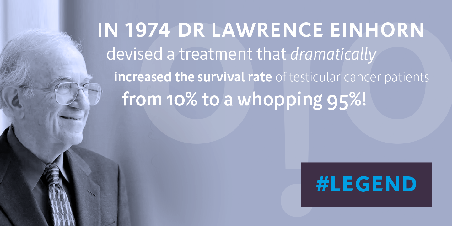
In the 1970s, Lawrence H. Einhorn, MD, an American oncologist transformed testicular cancer treatment spectacularly when he devised a new three-drug chemotherapy regimen that increased survival rates from 5–10% to a whopping 70%, and today survival rates for testicular cancer are close to 95%. He's an absolute legend and without his pioneering treatment, I probably wouldn't have seen my daughters grow up or start designing typefaces again. Einhorn Sans seemed the perfect choice.
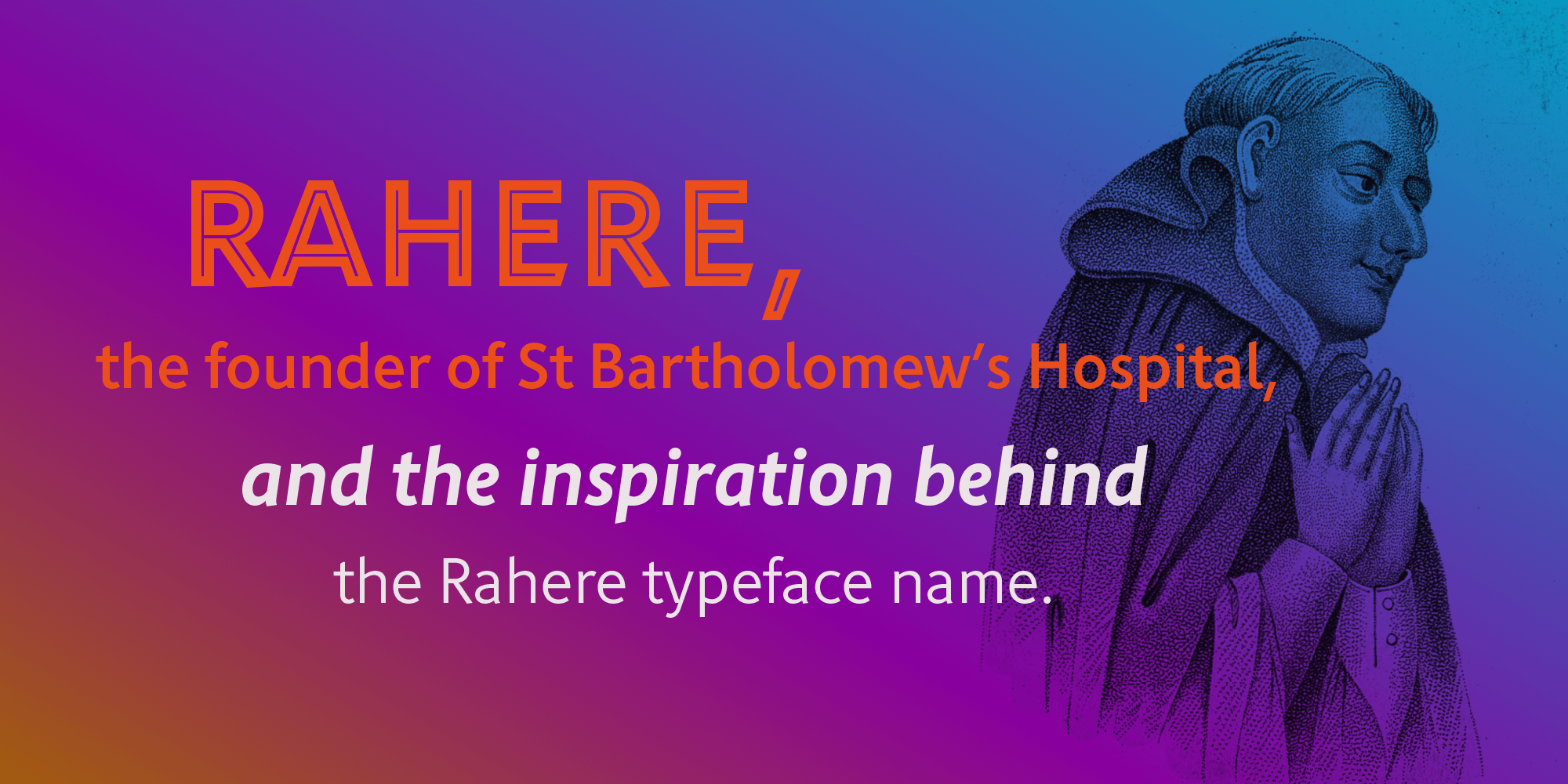
However, as the design stuttered slowly into a fully fledged family, I found out that there was already a typeface on the market named Einhorn. Double humbug! I had to start again, but it wasn't long before I came across Rahere, who founded St Bartholomew's Hospital in 1123. I loved the name, and it also had the emotional connection that I wanted too.
Rahere was an Anglo-Norman priest and monk, and one of King Henry I's preferred courtiers. During a pilgrimage to Rome, he became ill, and – reputedly – St Bartholomew (one of the twelve apostles of Jesus) visited him in a dream with a message to set up a religious hospital.
I'm neither a historian nor a researcher, so rather than splash around in puddles of inaccuracies (especially after Google Bard's AI gaffe) you can find out more about Rahere at these websites:
- https://www.british-history.ac.uk/st-barts-records/vol1/pp37-55
- https://en.wikipedia.org/wiki/Rahere
As 2023 marks the 900th anniversary of St Bartholomew's Hospital, I feel this is the ideal time to revisit Rahere.
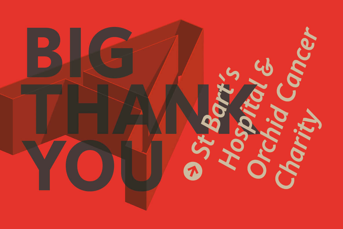
I'm indebted to all the doctors, nurses and support staff who work there, plus a special shout out to Orchid Cancer – a UK charity that helps men affected by cancer – who funded the research for my treatment.
Rahere Sans is a versatile humanist design that works well across different media and sizes. Rahere Roman Display is a classic titling font with loads of alternatives, ligatures and ornaments. You can view or purchase all the various flavours of the Rahere typeface family: