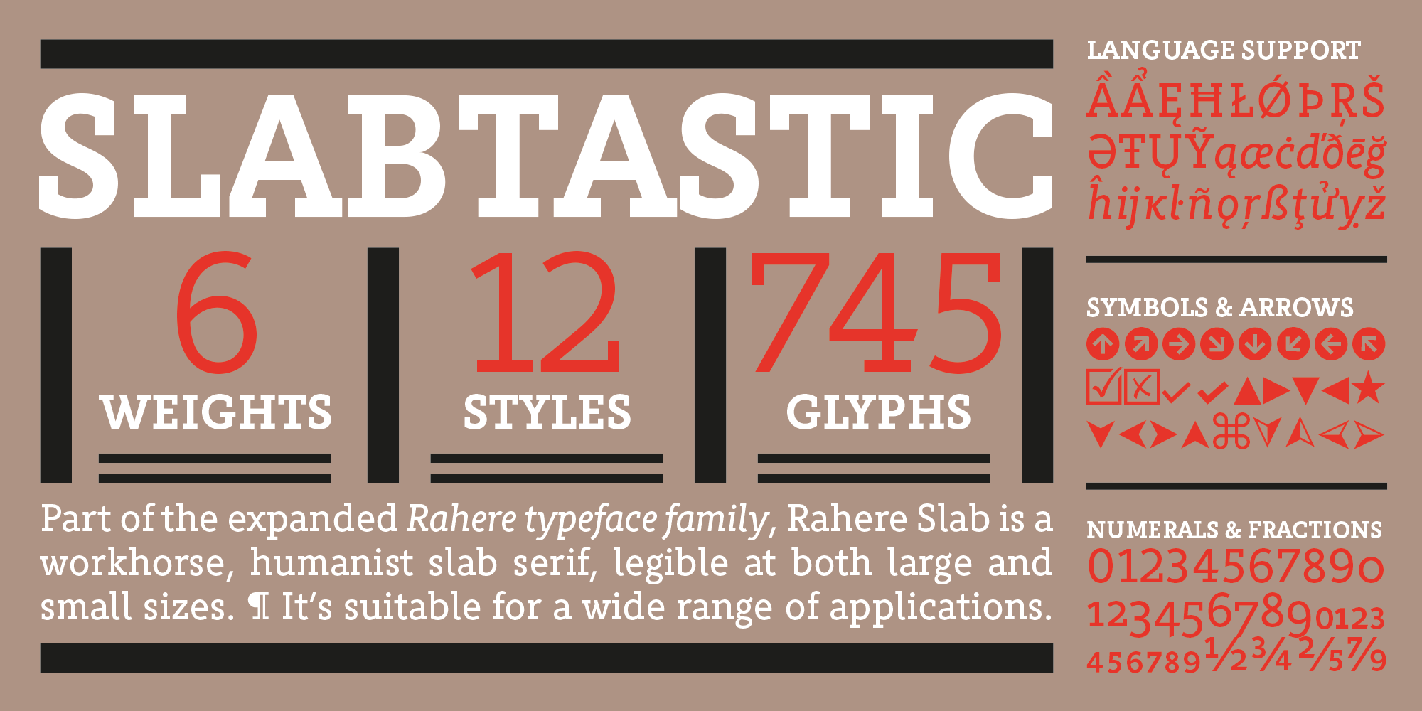
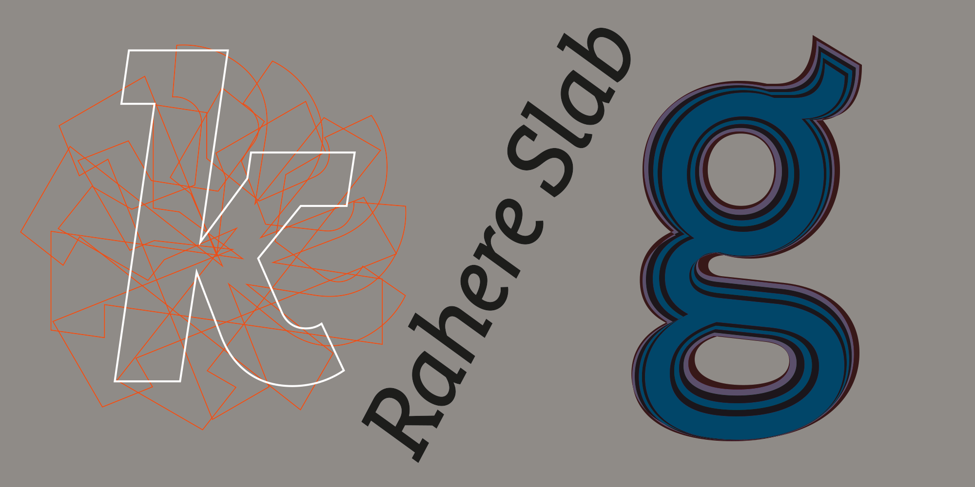
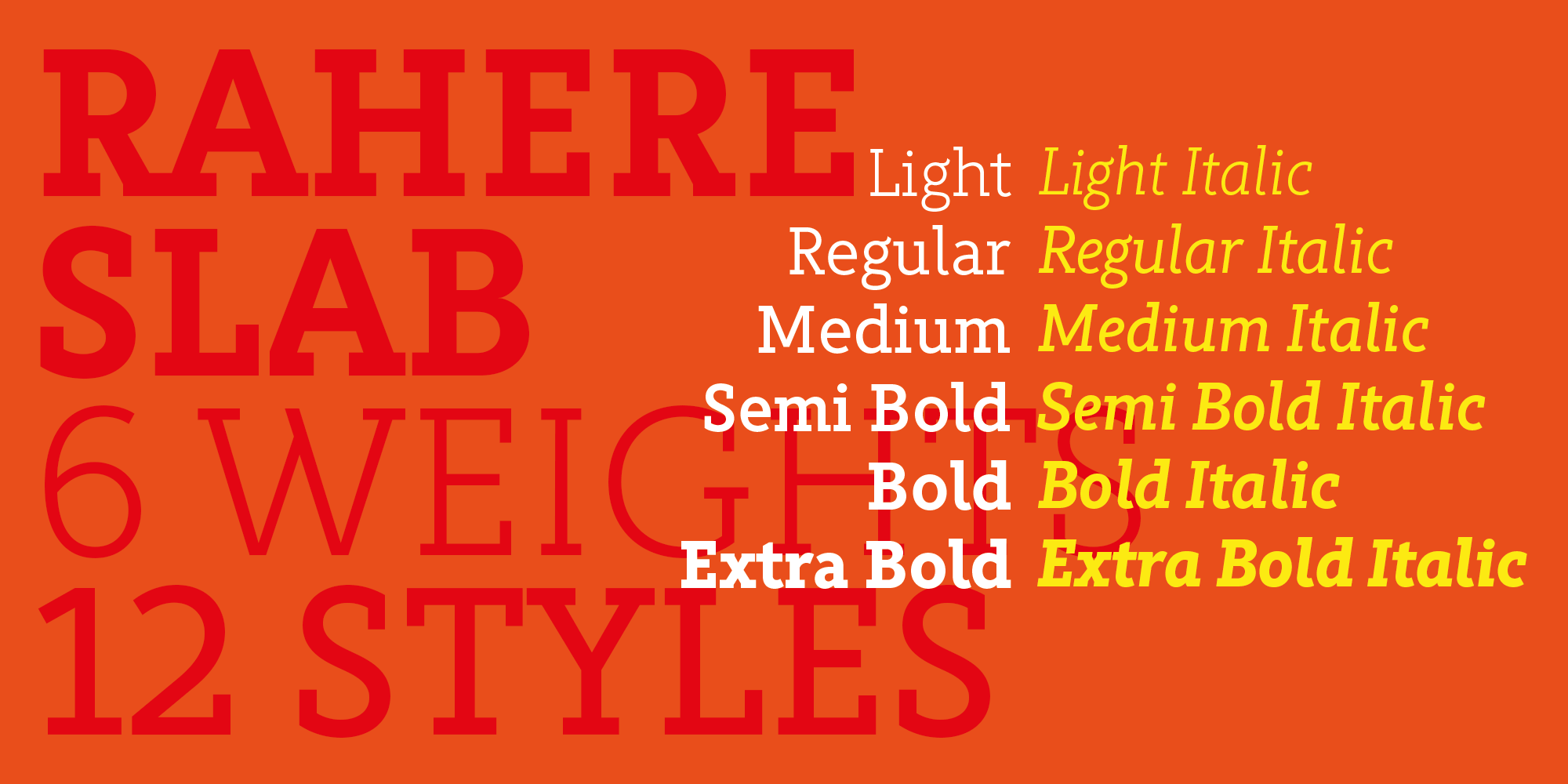
Part of the extended Rahere typeface family, Rahere Slab is a humanist slab serif (or Egyptian) in six weights from light to extra bold with corresponding italics.
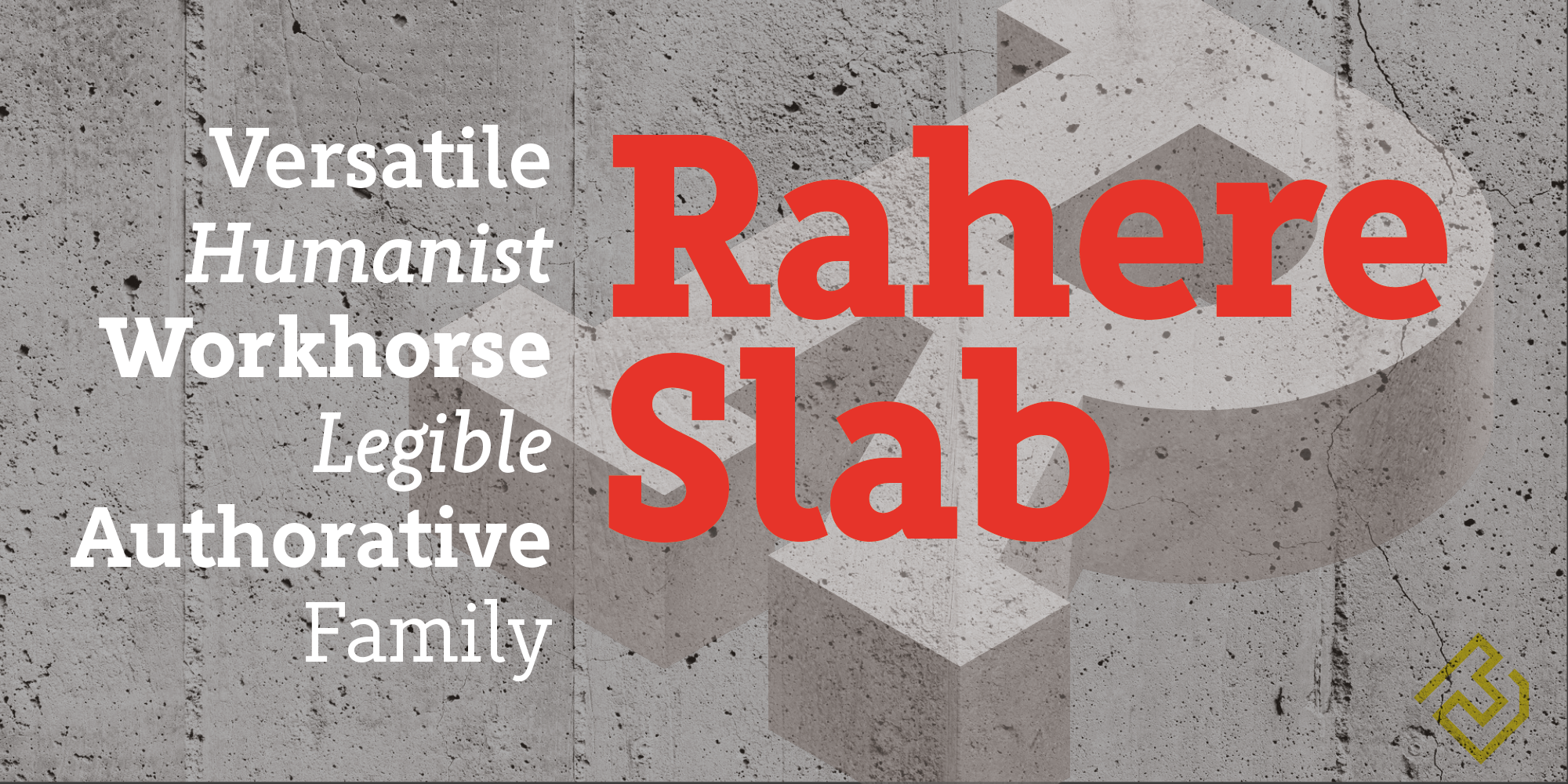
Rahere Slab – like its sibling Rahere Sans – features subtle detailing, giving the typeface a distinctive, warm appearance without distracting the reader. Legible at large and small sizes, Rahere Slab is a versatile, workhorse typeface suitable for a wide range of applications such as information signage, packaging, annual reports, advertising, brochures, catalogues, screen text and visual identities. For projects that need to convey a sense of authority tempered with diplomacy, or if the message just needs some serious oomph, this is a great slab serif for the job.
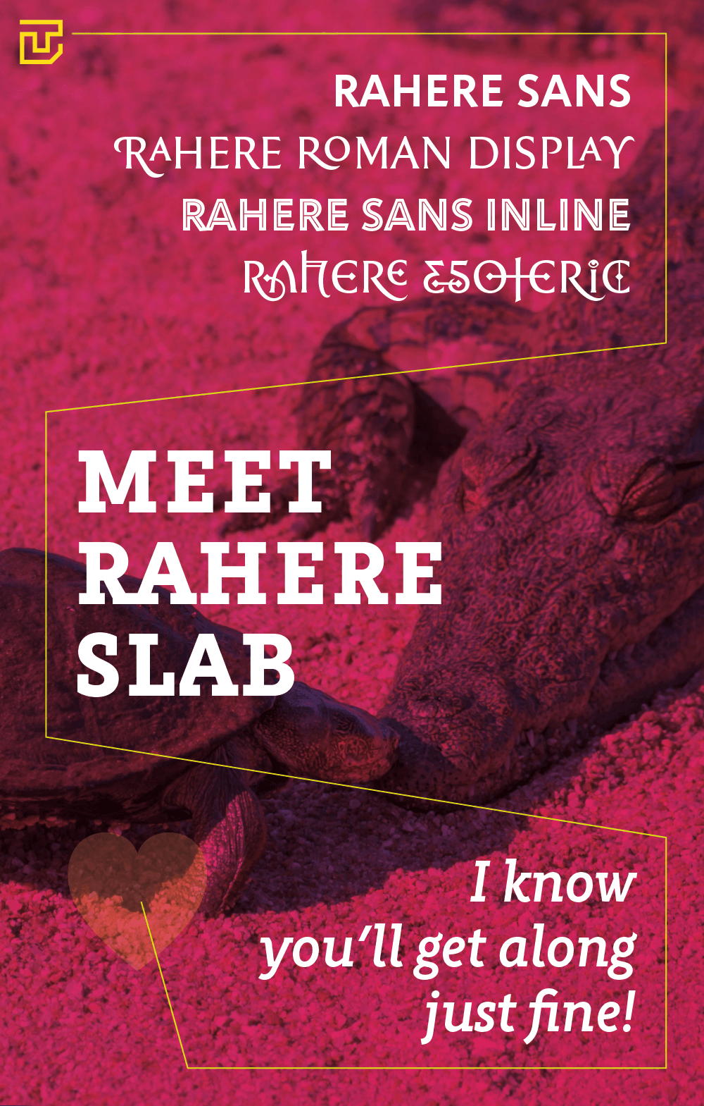
If a companion sans serif is needed, Rahere Sans works beautifully with Rahere Slab.
The character set covers most European languages plus Vietnamese. Each weight contains lining & non-aligning numerals in both proportional & tabular spacing. The tabular numerals share the same width across all weights and styles (matching Rahere Sans too) – a must for financial tables in annual reports.
The italic lowercase is more cursive and calligraphic than the roman, but it harmonises perfectly, displaying enough character to create emphasis without looking out of place. When used on its own (for example, pull-out quotes), the italic exudes a charm that draws attention to the text.
Rahere, founder of St Barts in London
The typeface is named after Rahere, a 12th-century Anglo-Norman priest, who founded the Priory of the Hospital of St Bartholomew, London in 1123. In 2007 I was successfully treated at Barts for relapsed testicular cancer so, naturally, I'm indebted to all the doctors, nurses and support staff who work there. A special shout out to Orchid Cancer – a UK charity that helps men affected by cancer – who funded the research for my treatment.